Dunkin’ Donuts Redesign
Giving Dunkindonuts.com a makeover with premium content and content strategy
Defining a new Dunkin’
The original ask from the clients was just to provide a .com design update, but we quickly discovered they would need a new strategic direction as well. One of the very first questions that kept coming up was “I don’t remember going to a casual dining website.” We noticed a lack of site visitation to the Dunkin’ website ever since Google started displaying utilitarian information such as menu, nutrition, and closest store at the search level. So we decided to change the focus of our redesign to provide an experience that was compelling enough to create an emotional connection with the user and go beyond a transactional relationship. We positioned the pitch so that it was not an exercise in the information architecture of DD.com but rather an opportunity to accelerate digital leadership.
Defining the role of dunkindonuts.com in driving: Brand preference, Relationship deepening and Commerce
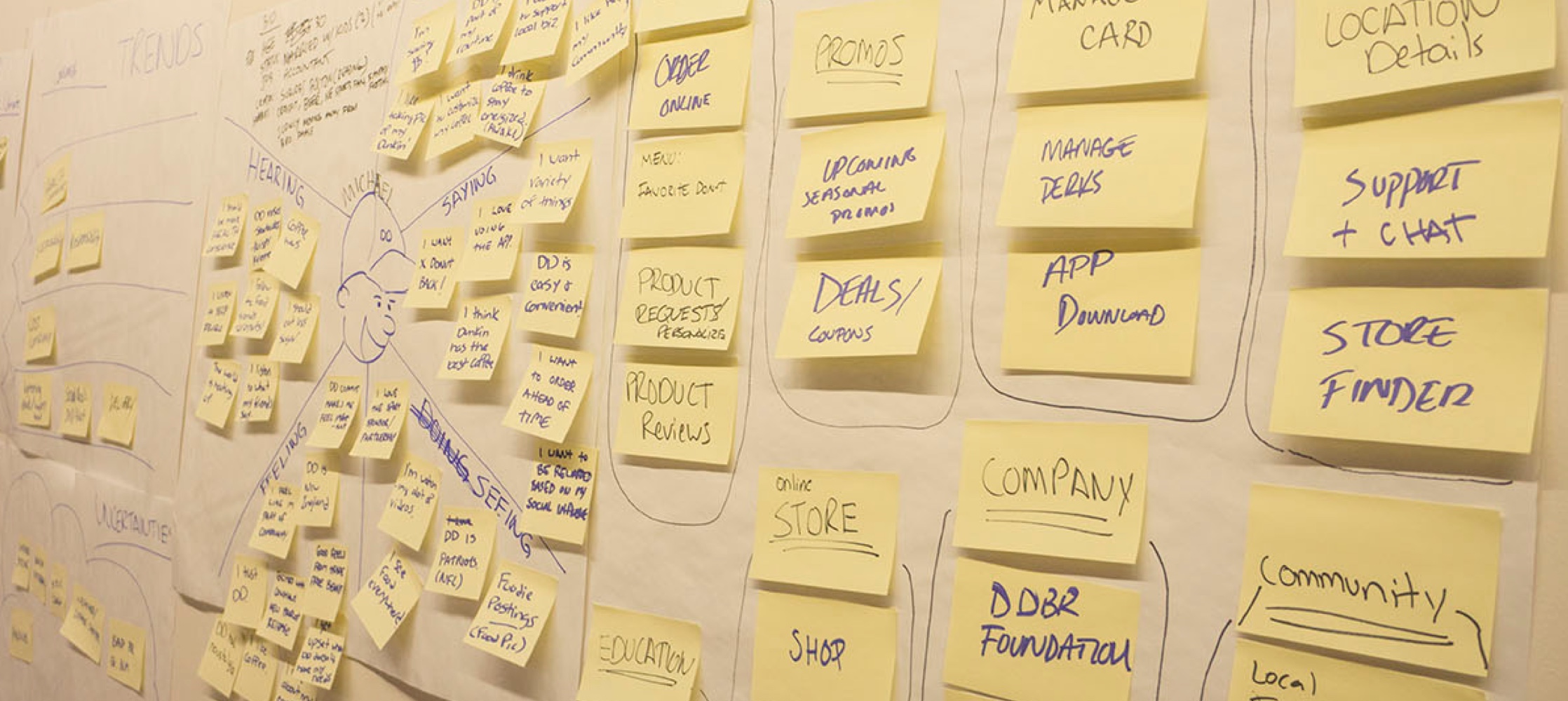
The Process
Throughout the ideation phase we decided to map out Dunkin’s experiences maps. We started with Customer journey maps to show how customers progress through our their existing website, often highlighting the frustrating moments alongside the delightful ones. Next we explored System relationship maps to describe how the customer interfaces with the brand, revealing system level interactions that happen for every action a customer takes. And lastly empathy maps explore what our customers see, think, say, and feel, as they interact with our Dunkin’ Donuts.
Intimacy at Scale
We designed the homepage to be as flexible as possible, in order to give a sense of intimacy. Focusing on the user, helping that with what they need to do and being adaptive. The structure of the homepage was designed using multiple components to provide flexibility. In once instance the home page would lead with a brand story, if you came through a specific journey looking for the menu - the menu block would be served first.
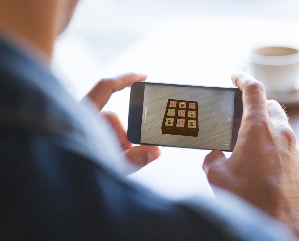
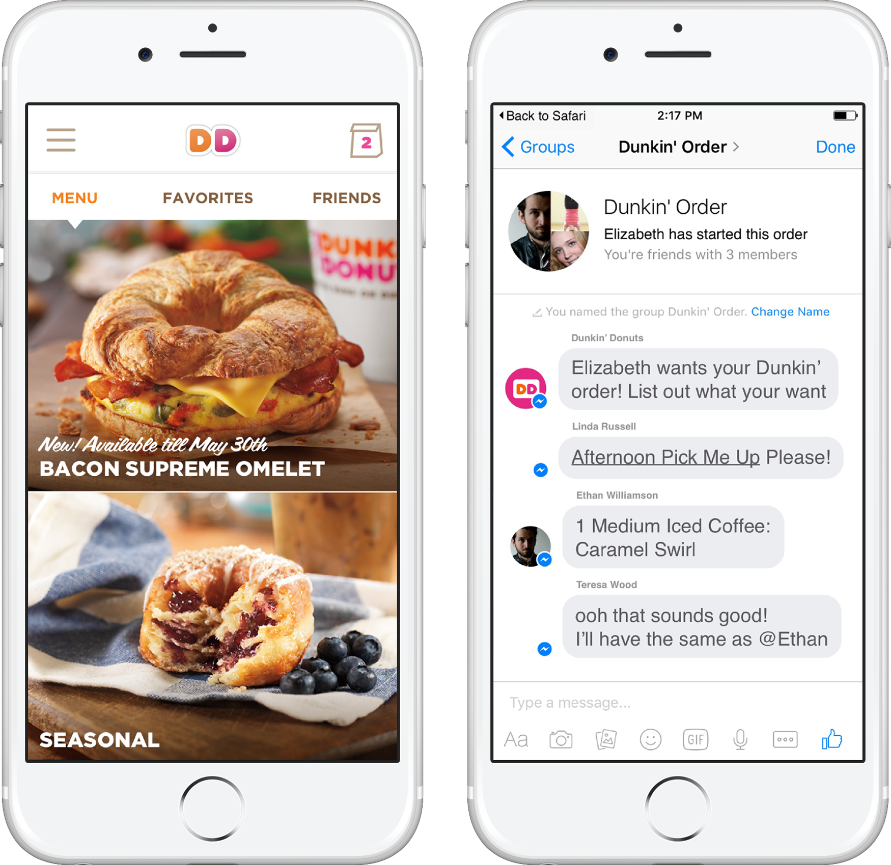
Elevate the products, Speed up routines
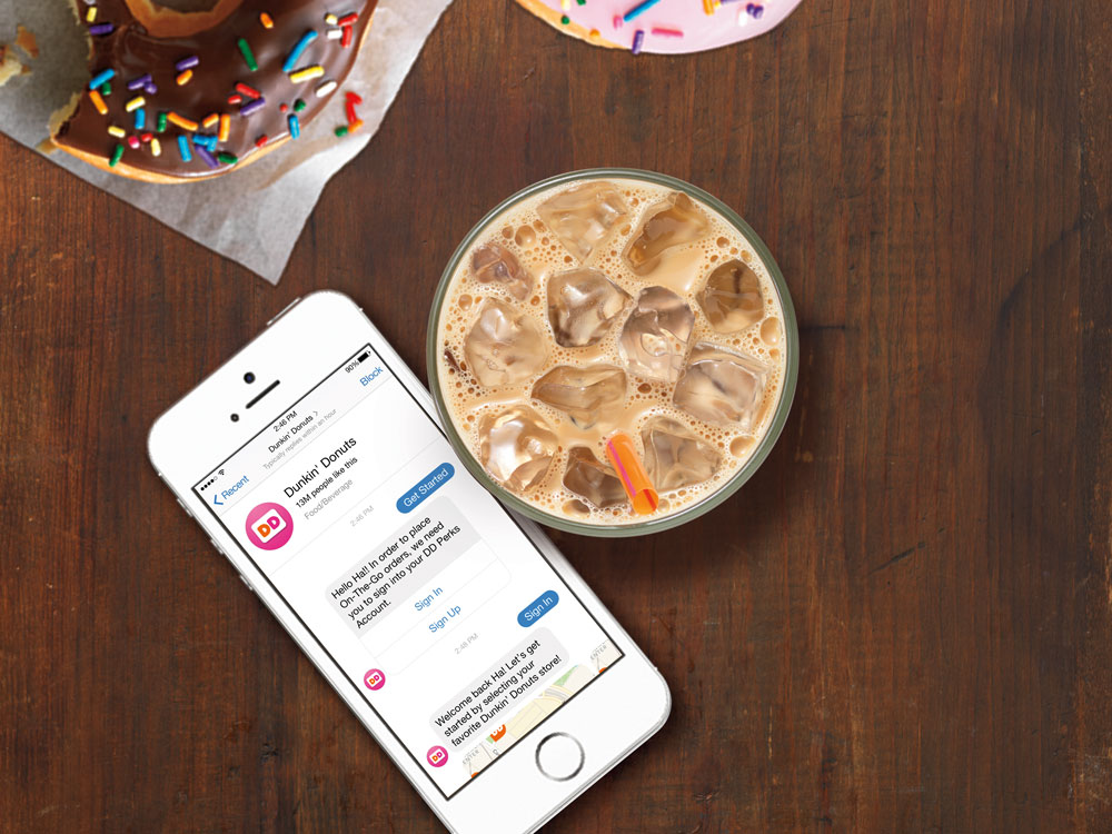
We have only seconds to make an experience delightful and meaningful for the user. Within those few seconds, we had to quickly make a product story feel like part of the overall brand narrative and then provide a clear on-ramp to making a purchase straight from the site. By introducing a Facebook bot, we can allow users to make group orders in seconds.
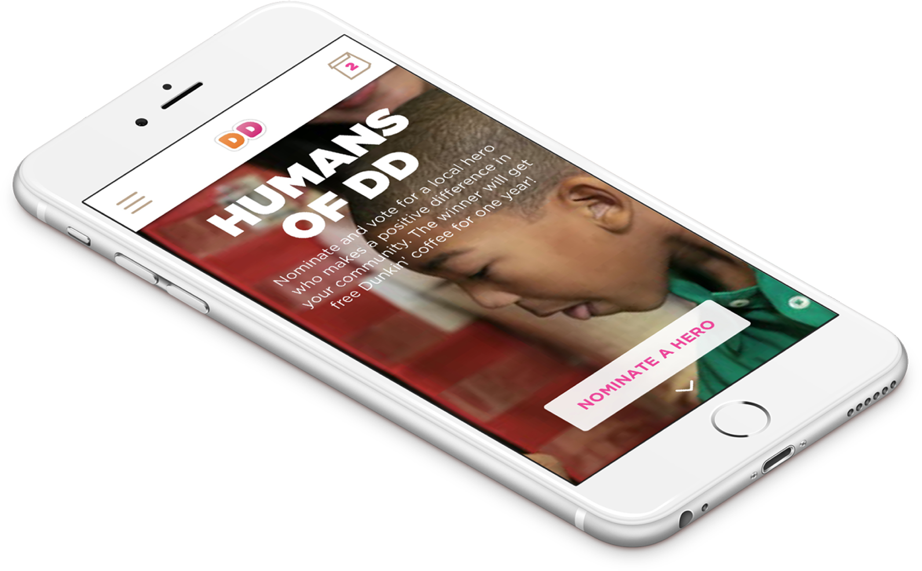
Act like a Local
We wanted our redesign experience to feel more like a digital expression of coffee culture than a generic product-centric brochure. Rather than creating a one-size fits all product detail page, we created an individualized experience by bringing in content that’s relevant to you at all the right moments, as well as showcasing location-based community service projects you can be a part of.
MVP Launch
Much of the conceptual thinking from the pitch made it into the MVP. The design we were able to launch with was not only a place for customers to learn about the Dunkin’ brand and products, but an experience that helps them accomplish the tasks they came to the site for. A week after launch, enrollment in the Dunkin’ Donuts Loyalty program doubled, the bounce rate dropped by 8%, and time spent on site increased by 22%.